
I went on holiday for a week. I came back to Microsoft’s new search engine (or decision engine as it seems to be calling bing).
Here are 12 reasons why it’s a usability nightmare. Imagine if I’d looked more closely … (if you like this post, you might enjoy my one on tap usability and web design (honestly)).
<update>I am talking about Bing UK here. I’ve now distinguished between points which appy to bing UK and those which apply to bing USA as well. The comments upto Yohan’s were made before this distinction was added.</update>
1 It doesn’t say what it is
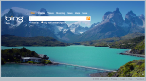
what is bing
Bing UK only.
What is it?
I’ve read elsewhere that it offers cashback if you buy stuff that you find via it.
And apparently it’s going to be great at product search and maps.
Er, but wouldn’t it be good if it explained its propositon somehow? I can see no reason to use it from a big picture, nice as it looks …
2 What’s with the wierd line that opens a little box?
So when you get some search results, a wierd line appears at the right when you mouse over individual results.Bing UK and Bing USA.
At first, I presumed it was some sort of indicator of where your mouse was.
Eventually I discovered that if you move to the right of each result (about 80% along should do it) a box appears with some more information about the result.
Who the hell moves their mouse 80% along a search result on the off chance it might make a box appear?
OK, that could be fairly useful – but how many people will never actually notice this functionality?
3 The extra info box keeps vanishing when I try to use it
Bing UK and Bing USA.
Of course, I spoke too soon. Using the box is a nightmare. Look at this example.
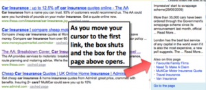
How moving your mouse towards the box makes it shut
So I moused over the bottom result, and moved the mouse towards the wierd line.
The box opened. Hooray. I moved the mouse up and across towards the first link – at which point the box closed and the box for the result above opened instead. (This is because the top link in the box for the bottom result is level with the result above.)
It reminds me of those awful multi-layer flyout menus where if you move one pixel in the wrong direction, everything closes and you have to start again.
4 The extra info box is a bit rubbish anyway
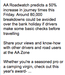
Old bing data
Bing UK and Bing USA.
And of course, the box is only as useful as the information in it.
In this example for the AA, it’s showing some text from before the bank holiday 10 days ago.
Why would I want to see this?
If you’re going to show this sort of thing as an integral part of your functionality, it needs to be more up to date than 10 days old.
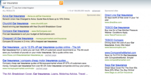
5 And if it’s not old, it’s meaningless
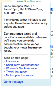
bing pointless text
Bing UK and Bing USA.
And this is the text for another of its results for car insurance.
Apparently some phone lines are open.
Great. Er, what’s the phone number?
And why would I care anyway?
I’m sure they can’t review each page’s results manually – but surely they can do a better job at working out what’s important on a page? That bit of copy is from underneath the left-hand menu.
What’s the point of developing block level analysis if you’re not going to use it?
6 Let’s return to the search box: what are those links about?
Bing UK only – Bing USA is properly integrated.
OK, so let’s look at the actual search box again.
Above it are links that say “Web | Images | Videos | Shopping | News | Maps | More”.
![]()
bing options: very confusing
I’m not quite sure where to start here.
If you click images, videos or news then the picture disappears briefly and then reappears. To no obvious purpose.
Even worse, click Shopping or Maps and you go to a completely different website. How unexpected is that? Why haven’t they integrated shopping and maps into Bing?
7 The most pointless more link ever
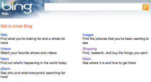
bing explore page
Bing UK only – Bing USA shows xRank only next to relevant searches.
So one of the links above the search box is ‘More’.
Clicking this gives you the same list of options (Web, images etc) on a virtually empty webpage but with a 6-word summary of each.
For images, you can “Find the pictures that you’ve been wanting to see”. Oh, so that’s what an image search is.
But look – the ‘more’ page has one another option: xRank.
So it gives 6 options, and if you click more, it gives you the same six plus one more.
Wouldn’t it have been simpler to put xRank where it says More above the search box? They you wouldn’t need the ‘More’ page. Let’s not go into xRank. I haven’t the energy.
8 That funny bit in the top left
bing top left links. or not.
Bing UK only – Bing USA has a proper link to a tour of Bing.
There’s some funny links at the top left. They say ‘Bing’, MSN and Windows Live. Now, this does raise the question of whether it’s Bing or bing.
WHICH IS IT?
The logo looks like bing, and in the sign-in page it’s bing. But then this link here is Bing – as it is in the browser title bar.
Oh, it’s except it’s not a link. It’s just the word bing, styled to look like the two links next to it.
Maybe it’s some new pan-microsoft link bar? No, it’s not on the MSN or Windows Live pages it links to. It’s just pointless.
9 Where has that ‘Add bing to your browser’ link gone?
Bing UK and Bing USA.
I was looking at one page and it said ‘Add bing to your browser’ in the top right. That link has now vanished and I can’t make it come back. (Actually, perhaps it’s doing me a favour …).
10 It’s all ads anyway
It’s all adverts
Bing UK only – Bing USA gives you many more options.
Of course, when you do get some results, you can’t really see them that well, as the whole screen is taken up with sponsored links.
How many sponsored links do they need?
They can’t need that much money – they obviously didn’t have a budget for user testing …
11 Sign up? What for?
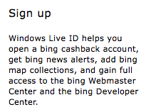
bing sign up
Bing UK only – Bing USA gives proper explanations.
So we’re nearly at an end. Let us turn our attention wearily to the ‘Sign up’ link in the top right.
Sign up? For what? Why? Oh go on then, I’ll click it just to see what it is.
I’d like to make it clear that when I’m using a site for real, I don’t waste my time clicking pointless looking links on the off chance they might be useful.
Anyway, you get this if you click it. Sounds … confusing. What is this stuff? Cashback? bing (lower case) map collections? Tell me how I can find out more. I’m not signing up until you do.
12 bing community
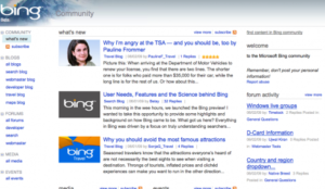
bing community. Huh?
Bing UK and Bing USA.
If you click ‘extras in the top right, and click blogs, you get to bing community.
WHAT IS THIS?
I really don’t understand. There are some blogs – are they written by Microsoft people? Can anyone write them?
Apparently “The Bing Travel blog provides the information you need to travel smarter and kicks off debates on the most timely travel topics.”
It doesn’t, as it ignores any best practice about writing for the web.
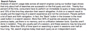
A large paragraph.
Check this one out. This one paragraph headed search failure has 168 words and 10 sentences.
The paragraph before is called ‘Information overload.’ You said it.
Summary
To sum up.
- I don’t know what bing is for.
- I don’t know whether to call it bing or Bing.
- Its links are confusing or pointless.
- Its functionality is unusable and pointless.
You can read some other reviews of bing here, here and here.
You might also like
- BUSTED: bing defender is Microsoft employee – and have they deleted my post on bing’s usability from bing?
- 14 ways Bing UK will get better when it catches up with Bing USA
- 6 ways Bing USA insults the British (and 1 the French)
- Google indexes 168,000 pages of Bing’s social search results
- Bing xRank – it’s rubbish as it can’t distinguise volcanos from 90s bands
Leave a comment!