
Google has redesigned Webmaster Tools. Some of it’s good. Some of it I hate. This is what I hate about the design (on top of that fact it’s much slower than the old version) – and at the bottom are two more from Christian Schenk.
1 Pagination has been removed from links data
You can see how many inbound links each page has got. In the old design, you could choose whether to look at data for 20, 30, 50 or 100 pages at a time.
With the new design, you can only see data for 25 pages at a time – which is a lot of pointless clicking.
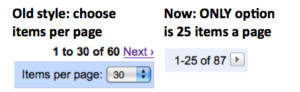
Old vs new options for reviewing inbound link data
2 Pages that are 301 redirected are listed separately in links data
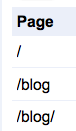
301ed URLs are listed separately
I 301 redirect www.malcolmcoles.co.uk and www.malcolmcoles.co.uk/blog to www.malcolmcoles.co.uk/blog/.
Under the old system, I’d see these 3 URLs amalgamated under /blog/ when reviewing the inbound link data.
Now, they are listed separately. So if I want to see links to my home page (which is what any of those 3 URLs is), I have to review 3 separate sets of data.
3 The webpage looks rubbish in a wide browser window
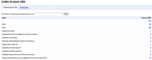
Data is miles from label
Much of WMT shows a URL and a bit of data about that URL. But the pages stretch to fill the browser. So if you have a wide browser window, the data is miles from the label (the URL).
I can’t see any real need for this. Can’t they put it in a table? I don’t want to have to shrink my broswer window just to use Webmaster Tools.
4 It truncates URLs when it doesn’t need to
Under the crawl errors, if URLs are too long, it truncates them – by chopping the middle out. This makes them hard to read. Actually, it used to do this in the old design, but it’s still annoying.
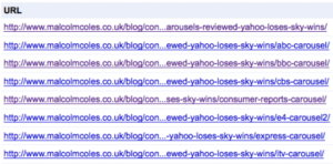
URLs truncated in the middle
5 What do all the menu items mean?
There used to be landing pages for the main sections in webmaster tools. These were a bit pointless as they added an extra click to get anywhere. But they did contain an explanation of every page in the section.
They’ve got rid of these landing pages, and every page can be accessed from the left-hand menu.
All very well, but now there’s nowhere to go to see what each page means. Couldn’t they use the new method of accessing pages from the left hand menu AND still have the landing pages for people who don’t know what all the terms mean?
You might also like
- What does this Google Webmaster Tools data mean?
- Google results: all adverts
- Think Quarterly: 7 things I hate about Google’s new online magazine without having read a word
- Information Commissioner: please redesign your stupid form
- What The X Factor tells us about Google’s keyword and search-volume analysis tools
Leave a comment!